Cropping dilemma
Monday 6 February, 2012
Been having quite some dilemma lately. When Niklas (the wizard behind this site) and I talked about the frontpage on the site we had a few ideas about how it should look. It seemed like we booth wanted to have some kind of sliding gallery with around 10-15 photos on the start page. So far we were on the same track, but then we went apart. Niklas had a wish to build the site so it would be compatible with most computers without a scroll on the side. I bought that tought, but also realized how hard it would be for me to find 10 photos of mine that would fit in this format 910*400 pixels. I don’t ever think in these terms when taking a photo, the same as with B&W. So I had to crop and play around with the photos I already had that was taken with other proportions. Niklas tought that I should think in an artistic way and make something different with it, instead of trying to make normal photos look decent enough in this new format. Guess I in the end did something in between that I’m not really that satisfied with. But that’s all good, beacuse now I have a mission to take some new photos for the start page.

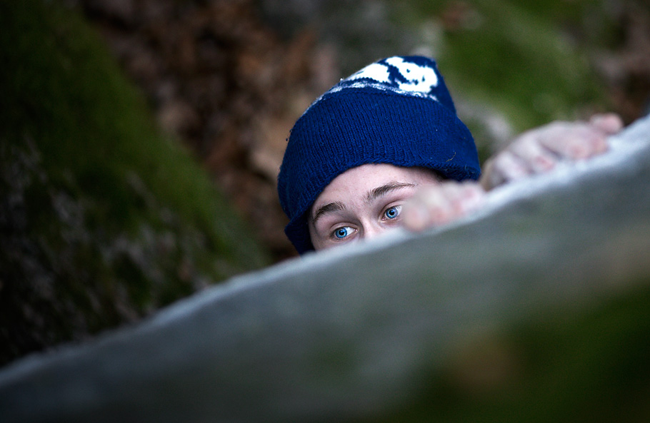
This is the latest image I tried to do something with so it would fit on the frontpage.

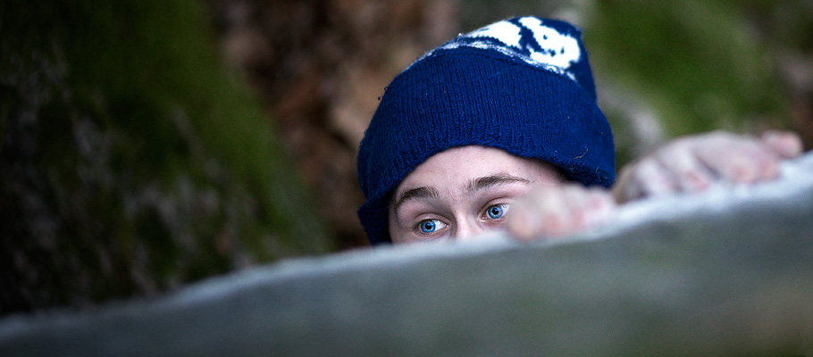
And this is how it turned out to be after I cropped and rotated it.
As you can see it turn out to be a different image in this format, this time maybe not as different as some other times. Often it’s quite hard to even imagine how the image is going to look before one has tried to crop and adjust it in some ways in CS.
